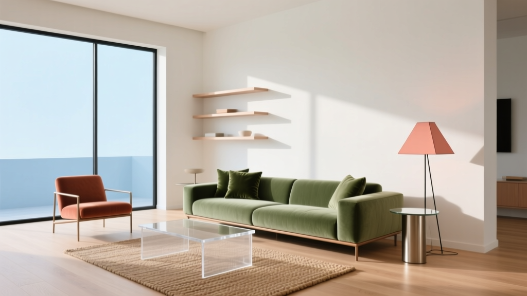
Bedroom Color Schemes That Promote Better Sleep
The Science of Color and Sleep
Research from the National Sleep Foundation shows that bedroom color directly impacts sleep quality. Cool tones like blue and green lower heart rates, while warm reds and oranges can increase alertness.
Top Sleep-Optimized Color Palettes
1. Soft Blue + Warm White
The most research-backed combination. Blue walls (specifically shades like Benjamin Moore "Palladian Blue") paired with white trim create a calming, hotel-like atmosphere.
2. Sage Green + Cream
Green is the second most sleep-friendly color. Sage provides a natural, grounding feel without being too dark or overwhelming.
3. Warm Gray + Lavender Accents
A sophisticated neutral base with purple accents. Lavender has been shown to reduce anxiety and promote deeper sleep.
4. Dusty Rose + Charcoal
For those who prefer warmer tones, dusty rose provides comfort without the alertness of bright reds. Pair with dark accents for depth.
Colors to Avoid
- Bright red: increases heart rate and alertness
- Vivid yellow: overstimulating in large doses
- Pure black: can feel oppressive in small rooms
Lighting Considerations
Use warm white bulbs (2700K) with dimmers. Avoid blue-light LED strips in the bedroom. Consider blackout curtains to maintain darkness.